I've just completed a brand refresh for my lovely friends Dan and Amanda from Adelaide cafe and gift store "E for Ethel". The design brief was to retain some text elements from their existing logo, and also compliment the look and feel of their newly handpainted window and street signs.
I included a pattern of knitting in the logo set, and kept the tea cup element to link the visual message back the two distinct sides of the business, cafe and hand made products. View all elements of the brand set here >.
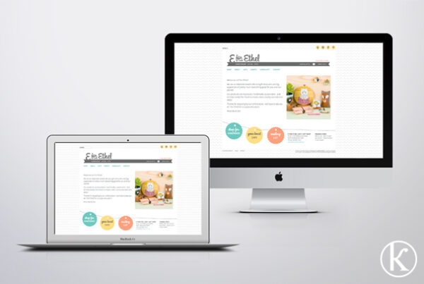
An enjoyable job to work on with the most gorgeous couple. Now onto the E for Ethel Website!!


